Tuesday, 19 February 2013

Website Proposal

1. Concept-
The main concept of my website is an educational guide for children between the ages of 8-11 that takes them through a condensed history of the development of technology (computers, CD's, phones) whilst introducing them to the idea of being part of a Global Village and understanding the division technology can create. My motivation for this project has come from the increasing rise in children using technology and having access to new devices from very young ages. This is something that is not only seen in households but is being encouraged in junior schools through the higher education, as schools are making the decision to eliminate basic forms of teaching, e.g. white boards, libraries, pen and paper, and replacing them with individual student tablets, electronic books and smart boards. I think it is important for this generation of children to be aware of where their current technology has developed from and also to provide them with an understanding that it is a luxury to have access to these and not every child in the world is as fortunate. The reason I have chosen this target audience is due to children being given mobile phones, Ipad's and gaming devices like X-box or Play-stations at such young ages compared to the last 10 years, and it is this generation that will be brought up with technology providing the main source of education, information and entertainment. I believe this website will be suitable for this particular target group as they are computer literate, and the topic of technology is something that would interest them and they will be able to relate to. e.g. my Grandad had that wireless, or my mum had that walkman. It may also add humour to the website as this age group may find the 'out-dated and old-fashioned' technology funny compared to contemporary devices. This website will also be suitable for this target group as there will be a page on future technologies that will enable them to get an insight into what is to come and if technology will ever stop developing.

2. Project timeline- 


3. Product description - 
The website will be an educational guide through the development of technology across all devices and platforms, for children between the ages of 8-11. It will enable them to see a visual history of how and where current technologies have developed from, whilst also providing a brief history of what that specific technology enabled people of that era to achieve at that time. The website will also show children where they fit in terms of a global village, whilst expanding their knowledge on how technology can also divide people, households, countries as well as bringing people together. My aim for this website is to produce a fun, coherent, simplistic, visual timeline for children to explore and appreciate, whilst eliminating any ignorance about the availability of current technologies. My website will provide children with an interest in the future of technology and may even provide them with a drive to find out more about this area and even create possible interest in subject choices/degrees/careers when they are older. It is important that this specific age group are coherent in these developments as it is these upcoming generations that will be taking the next steps in technology and will be living in a completely computer literate environment and new devices/platforms will become a passive and normal part of their lives. I want the website to be colourful and reflect the positive, opportunistic qualities that the concept of a global village brings whilst also using traditional primary colours that children can relate to and enjoy. The website will have simple and understandable navigation, to avoid confusion and complication on the site.

I want to use a character to act as a visual guide that takes the children through each time period,
and performs the role of an online buddy. The character itself will be a still image that will in a prominent position on each page. I want the character to be relevant to the theme of technology but also to be a fun and be able to stand outside of each time period as a contemporary character leading the user through a type of time machine concept. The character that I think would best fit these requirements would be a robot character as it is a personified piece of technology that represents contemporary developments and also represents the idea not knowing where the future will take technology users. As this website will be for girls and boys, the character needs to apply to both groups and therefore a robot suits this with an ambiguous gender.
I think this will provide them with an extra element of fun, but also lets each webpage come to life as they are being presented it by an online character. The character will introduce itself on the Home page, and will appear on every web page to provide consistency throughout the website, whilst adding bites of information in the form of speech bubbles, and even encouraging the children to click on specific videos/links etc.

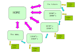
4. Flowchart and Wireframe -

Saturday, 16 February 2013

Good v Bad Websites

Here is a list of some of the common factors  that unsuccessful websites have...
  • Color combinations of text and background that make the text hard to read
  • Busy, distracting backgrounds that make the text hard to read   
  • Text that is too small to read
  • Text crowding against the left edge
  • Text that stretches all the way across the page
  • Paragraphs in bold
  • Underlined text that is not a link 
  • Default blue links 
  • Links that are not clear about where they will take you 
  • Large graphic files that take forever to load
  • Meaningless or useless graphics 
  • Anything that blinks, especially text
  • Multiple animations that never stop 
  • Junk advertising
  • Having to scroll sideways (800 x 600 pixels)   
  • Unclear navigation; over complex navigation
  • Too many focal points on the page
Compared to this opposite list of factors that successful websites have...
  • Background does not interrupt the text
  • Text is big enough to read, but not too big
  • The hierarchy of information is perfectly clear 
  • Navigation buttons and bars are easy to understand and use       
  • Link colours coordinate with page colours
  • Links are underlined so they are instantly clear to the visitor
  • Every web page in the site looks like it belongs to the same site; there are repetitive elements that carry throughout
  • No junk advertising
  • Set wrappers so you do not need to scroll sideways
  • No annoying animation or sound
  • Professional, clear layout
  • One main focal point
  • Paragraphs separated with images

Researching Examples of Good Websites

It is important to perform a user task analysis on websites to see how easy it is to work and to gain an understanding of primary, secondary and tertiary viewing, which separates the 1st, 2nd and 3rd things you first see when entering a site. These successful web pages are all targeted at children in a fun and exciting way and to get an understanding of why there are successful I have completed a mini analysis of each one.

This website example is presented like a story, instantly inviting you in. The colours are bright without being manic and the brown is a neutral colour for boys and girls. The main image is of mythical creatures which are scary yet intriguing and their is a picture of a boy and a girl thus avoiding gender bias. There is only primary navigation so the user does not get confused and there is only a few pages across the top to allow clear and logical transition through the website.


This website has the word 'PLAY' as the primary viewing. This will grasp the users attention whilst the two cartoon characters in the top right corner invite them to use the website. Again, there is only primary navigation so there is simple, clear navigation throughout. The colours are bright yet consistent and it is split in two halves like a story book. The four images are all links, whilst the 'GO' button is an obvious and clear link as well.

This websites green background and blue sky promotes going outside and having fun whilst the yellow represents sunshine and positivity. Each character has a clear circular image to click on, whilst the PBS kids logo fits in with the other images. The primary colours are representative of its audience and the main image on the spinning wheel is interactive and is a fun way to navigate. The pages are clearly headed 'music', 'games' and 'colouring' to allow simple, understandable access to each page.

This is children's centre website so is different in the sense that it will most possibly be used by parents, however it is still presented as if it is for children. The main tree logo is colourful and made out of children's hand prints which is fun and creative. The hand prints also guide the user through the left navigation as they appear either side of the tabs. The rainbow colours are complimentary and the main image of the four children at the top is cheeky and playful, presenting the centre as a happy and educational environment.

Researching Examples of Bad Websites

Here are some examples of badly designed websites. By researching these as well as the good it will allow me to look at similarities between them, and the reasons why they don't work. I will complete a short user analysis on each homepage to explain and discover why they fall into the 'bad' category.
This homepage does not have any clear layout or navigation. The default blue links are messy and unprofessional. Although the logo is colourful and positioned well it does not provide the user with any information as to what the website is for. The centre of the page is busy and unorganised whilst the white background is dull and uninteresting.  The text is also too small and difficult too read.


This home page is virtually impossible to read. The reflection effect on the text is unnecessary, whilst the yellow title is unreadable. The green frogs at the top should be at the bottom as a footer, and there is no navigation bar or any clue to a direction on the page. The frog images are not in line with the text and although the repeated frog background provides texture, it leaves far too many gaps without content on. The image needs to be centered and the colours re-thought.

 
This home page instant gives you a headache. There is no primary, secondary or tertiary direction or any clear navigation. There are too many images, colours and text and hundreds of unclear links. The title gets lost amongst all the other text and the neon bar at the top clashes with the rest of the page. I think 'less is more' is the advice I would give to this web designer and to decide on a set colour, text and layout. 


Learning CSS

CSS stands for Cascading Style Sheets and is the standard visual presentation of web pages. Once these style sheets have been produced they can be applied to the documents. CSS enables you to define how each marked-up element of your content is presented on the page i.e. is the paragraph's font Times or Helvetica?, bold or italics? any indents or margin's? CSS also controls the formatting and positioning on each of the elements.
 
An example I have learnt of how to format the size of the text in a paragraph would be..
p {font-size;12x;} this can be broken down as the text being 12 pixels high.
 
CSS has provided many developments for web design and has been key to allowing content to be displayed on multiple devices and also being durable for the future. Some other benefits of using standards-based coding are:
 
1. Improves Performance- pages are a lot smaller in size and therefore download faster.
2. Separate Content and Presentation- you can modify or change either the content or the presentation of your site without affecting the other.
3. Distribute content more easily- distributing content is much easier because the content is separate from any specific presentation rules.
4. Less work- you can write less code therefore it's quicker and easier to get the results you want.


Friday, 15 February 2013

Learning the Terminology and Software

Learning to use and be comfortable with specific terminology is a huge part of being able to design for the internet and comprehend the language therefore I will be using this Blog as a glossary for the concepts and functions that I am working with.

HTML: Hyper Text Markup Language- Language for web creating.
CODING: Text in the form of symbols and elements to create a website.
URL: Uniform resource locater- Global address for documents and resources on the web.
PRIMARY NAVIGATION: The horizontal bar that guides users through the site's content.
SECONDARY NAVIGATION: The side vertical bar that guides users through the site's content.
BARRIER ENTRY: A website where you must sign up before given access.
ELEMENTS: An individual component of a HTML document.
BROWSERS: An application that navigates to specific web pages.
CLIENT MACHINES: Device that requests pages from a server.
SERVERS: Programme that runs to serve the requests of other programmes.
IP ADDRESS: Unique number given to every device and machine.
ROUTERS: Route and direct web traffic accordingly.
HEXDECIMAL VALUES: Numerical system created for binary coded values in computing.
PADDING: Defines the space between an element border and the element content.
MARGIN: Defines the space around elements- top, right, bottom and left.
TAGS: Keyword assigned and linked to a piece of digital information.
CLASSES: Used to specify a style for a group of elements.
ID'S: Used to specify a style for a single, unique element.

Monday, 11 February 2013

My Website - Starting Idea's

My website idea is a child’s educational guide to the history of technology and an insight into The Global Village and how it can create Digital Divides.
 
What I want my website to be:
  • For junior school to early high school children aged 9-11
  • A timeline to provide children with an understanding of where the technology they use today has developed from
  • An easy to use, comprehendible depiction of The Global Village
  • Providing children with an understanding of The Digital Divide to show that not everyone around the world has access to the web or even basic technology
  • A visual representation of the development of technology
Aim:
Providing children with the knowledge to avoid them becoming ignorant about the availability of technology and appreciate the information they have access to.
To give them a historical perspective about their role in the Global Village and a certain amount of excitement about future projects and technologies.

Ideas for page topics:
Page 1 What is the Global village and Digital Divide?
Page 2  History: Introduction of Computers
Page 3  History: Social Media Surge
Page 4  History: Walkman's, MP3's, Ipod's, Ipad's
Page 5  What's next in my generation?

or

Page 1 The Global Village and The Digital Divide
Page 2 1950's-1960's Technology
Page 3 1970's- 1980's Technology
Page 4 1990's- 2000's Technology
Page 5 The Future
 
Names/Taglines for Website:
  • My Internet. My Future
  • Where in the World Wide Web am I?
  • The Big Bang and Me 
  • The FaceTubePod
  • The Global Robot

HTML- The Very Start.

When starting to learn about the 'behind the scenes' of  a website, it is crucial for me to first grasp the concept of HTML or Hyper Text Markup Language. This will be something that will be used throughout the process and therefore throughout this project my skills and knowledge will develop and improve. I will be learning about HTML from practical classes, online tutorials and specific books/articles that I have found.


HTML is a type of computer language that sits behind every website and allows you to structure the content you want to display in your browser. This language is in the form of coding consisting mainly of elements and tags. Each piece of HTML content has to sit within an element that has a starting and ending tag, whilst all other content sits within brackets throughout your page. There are hundreds of complex symbols and elements in HTML and each one creates a specific area on the website. It is this freedom and vast variety of codes that allows users to be as creative and original as they like.